A visual love letter to the unsung beauty of language
The spark came during an unexpected encounter. I was visiting my 95-year-old neighbour, who had just come home from a brief hospital stay. While there, I met her doctor, charming, eloquent, and, as it turned out, a wonderful storyteller. He spoke about his Berber heritage with such warmth and pride that both my neighbour and I were hanging on his every word.
Now, I’ve always considered my background to be a bit exotic, stitched together from several countries. But when it comes to writing, my roots are plain: everyone in my DNA tree uses the Latin alphabet. The doctor, however, pulled out his phone and showed us the Tifinagh script. I was floored. It looked like it had been carved from a different world, geometric, alien, ancient. As a creative, I felt that itch, the one that comes when something sparks your imagination. I knew I had to dig deeper.
This article is a visual journey through some of the most visually stunning, culturally rich writing systems I’ve come across. Starting with Tifinagh, we’ll wander through curving letters, boxy glyphs, and scripts born out of necessity, resistance, or pure human curiosity.
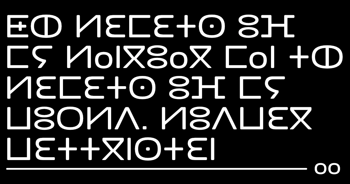
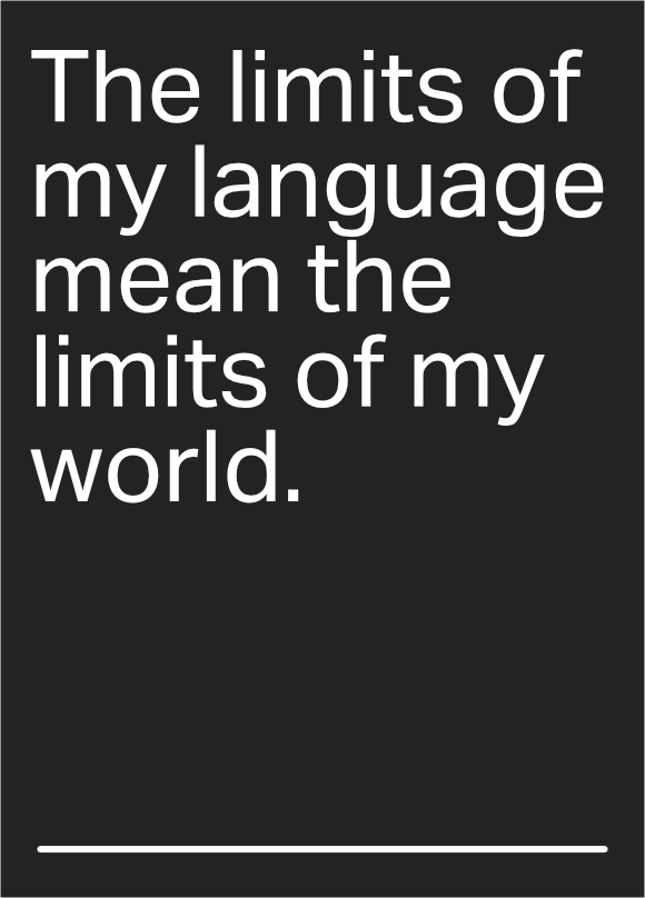
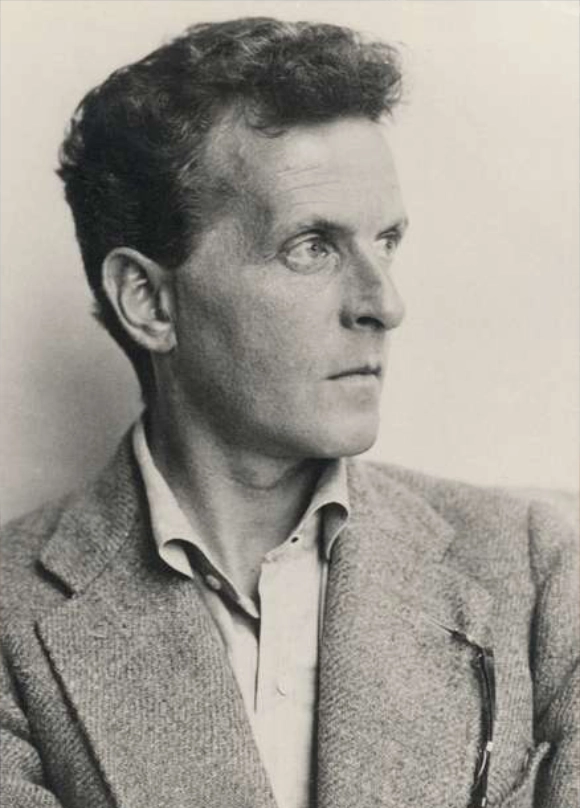
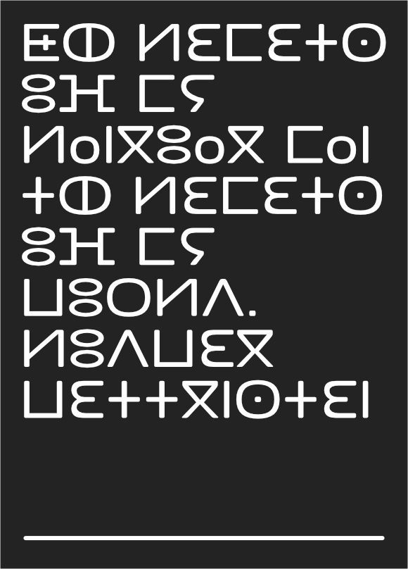
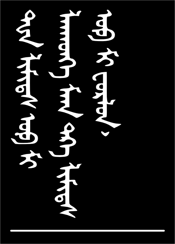
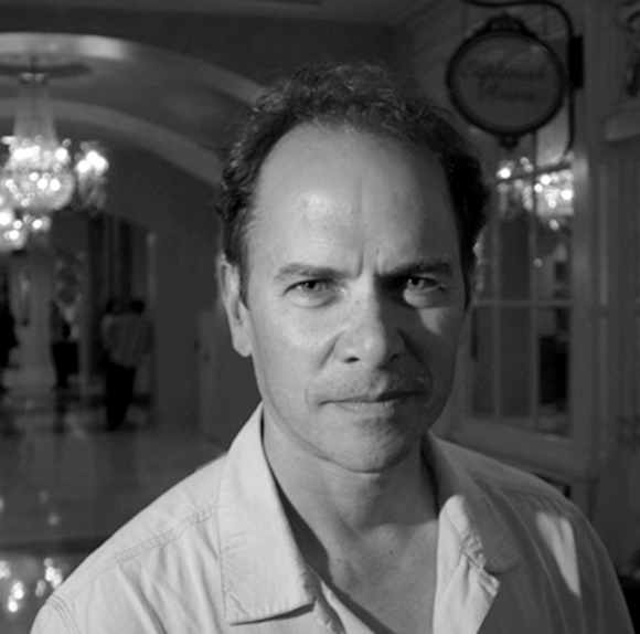
Alongside each script, I’ve included a quote from my favourite language philosopher, Ludwig Wittgenstein. Each quote has been translated into the featured script and placed beside an image of a person from the region where the writing system originated, giving you a little more context, a little more soul.
Tifinagh script
Let’s start with the script that kicked this whole thing off. Tifinagh is used to write several Berber languages across North Africa. It traces back to the ancient Libyco-Berber script and has survived thanks to the tenacity of indigenous communities. What struck me most is how unapologetically abstract it looks, like a blend of runes and starlight.
It’s not just a relic. Tifinagh lives on today, modernised but still fiercely symbolic. Seeing it on that doctor’s phone felt like being handed a secret.

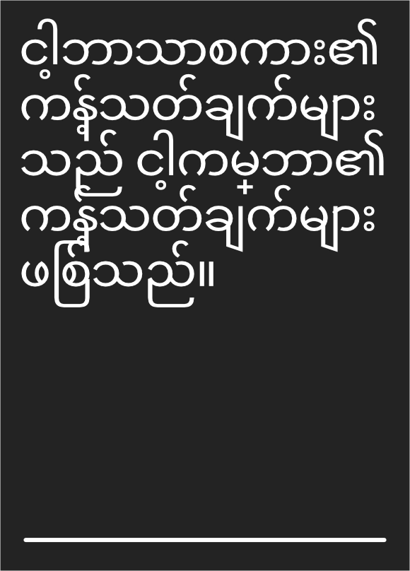
Burmese / Myanmar script
The Burmese (or Myanmar) script has a grand history, evolving from the Mon script, which itself was adapted from a southern Indian script back in the 8th century. Its shapes are rooted in practicality. Back in the day, people wrote on palm leaves, and straight lines would tear the surface. So everything became curved, soft, elegant. Aesthetics born from necessity. There’s rhythm in the repetition, almost like hand-drawn poetry. It’s a great example of how the tools and environment can shape the development of a script.

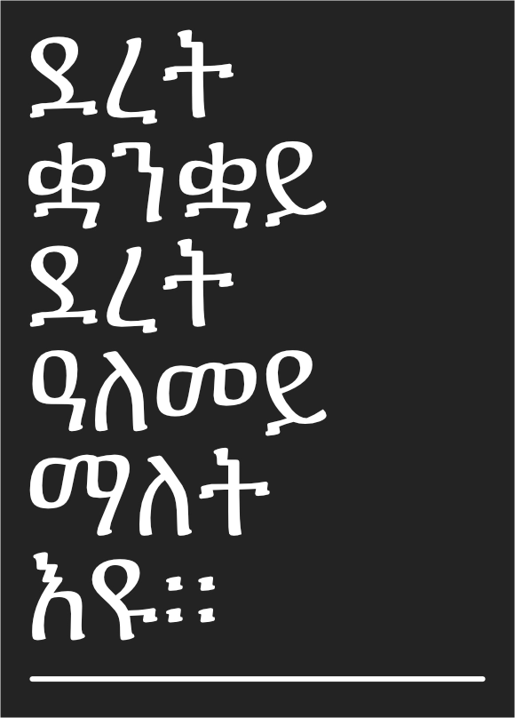
Ge’ez script
Tigrinya looks overwhelming. This Ethiopic Ge’ez script consists of 35 basic characters, but the challenging part for learners is that each character has several forms depending on the vowel it combines with. Most characters have 7 different variations, and some have even more. So, in reality, you’re learning an alphabet with over 200 characters. I’d find it easy to get lost, wouldn’t you?

N’Ko script
This script, called N’Ko, was actually invented fairly recently by Solomana Kanté in 1949. The story behind it is pretty interesting. Kanté was inspired, or rather provoked, by an article he read in a Liberian newspaper. The journalist praised a single African tribe in Liberia, the “N’fayinka,” for having a writing system. This didn’t sit well with Kanté. He was determined to create a script for West African Mandingo languages, and he succeeded beautifully with the birth of N’Ko.
Since its creation, the N’Ko alphabet has gained significant traction. A grassroots literacy movement has emerged, promoting N’Ko across West Africa, from Gambia to Nigeria, uniting all Mande language speakers.
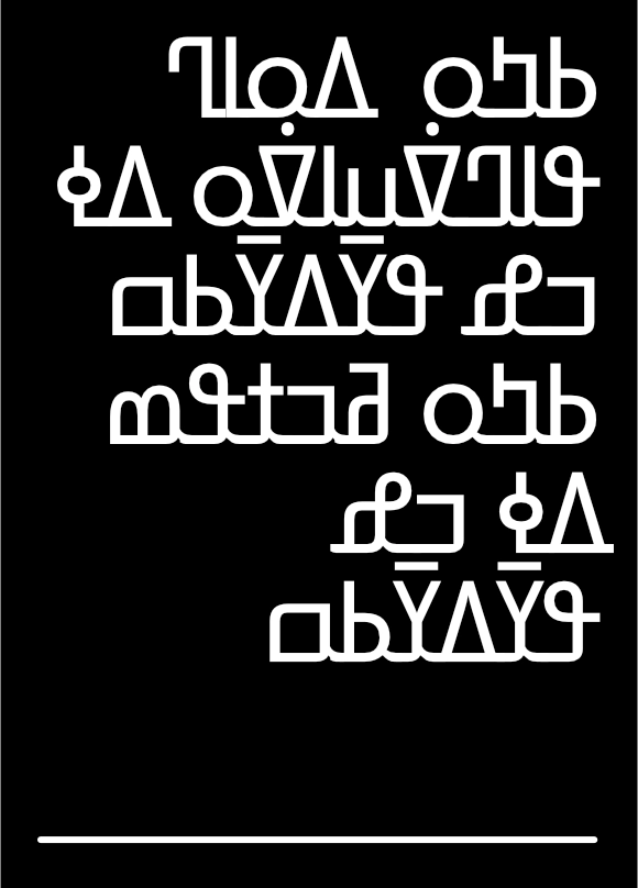

Meitei Mayek script
One of the fascinating quirks of this script is how body parts are used to the naming of its letters. In the Meitei language, each letter is named after a part of the human body. For instance, the first letter “kok” translates to “head,” while the second letter “sam” means “hair,” and the third letter “lai” stands for “forehead.” It’s intriguing to see how this script ties into the traditional Meitei belief that these letters and numerals were created by the supreme God.
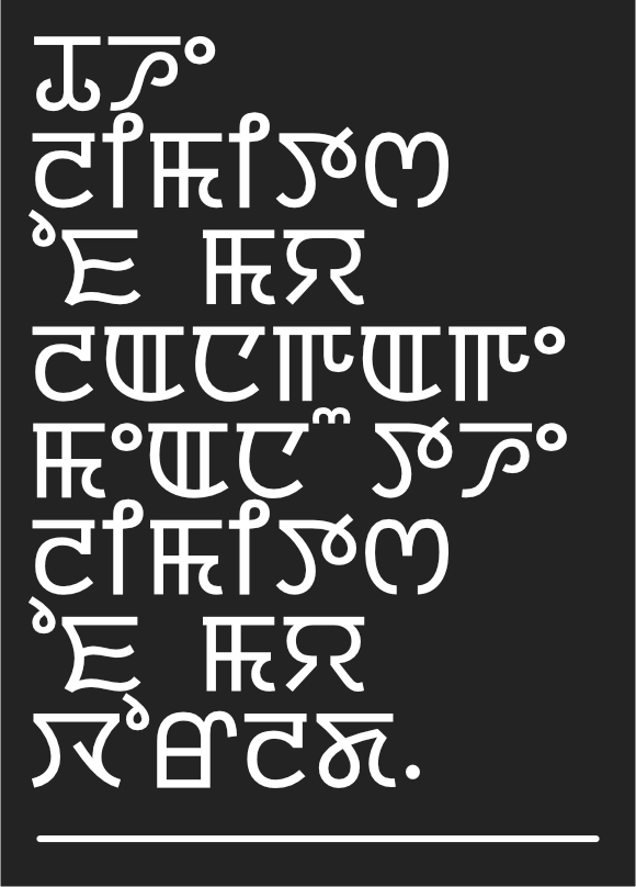

Manchu script
The Manchu script, created in the early 17th century by the Manchu people who founded the Qing Dynasty in China, is quite intriguing. It was adapted from the traditional Mongolian script to fit the phonetic needs of the Manchu language. Written vertically from top to bottom, its characters are based on the Old Mongolian script, which was influenced by the Uighur script.
Although it played a significant role in history, the Manchu script gradually fell out of use after the Qing Dynasty ended in 1912. Today, it’s considered a precious cultural relic, offering a window into the language, governance, and culture of the Qing era.

The Kigelia Typeface System
On a font-finding binge, I stumbled across The Kigelia Typeface System by type designers Mark Jamra and Neil Patel from JamraPatel, and I had to include it.
Mark Jamra
Mark Jamra has designed and produced typefaces for over 35 years. His lettering and typefaces have been shown in numerous exhibitions and have received awards. He has lectured, conducted workshops and taught graphic design, type design and history at colleges in the U.S. and Europe.

Neil Patel
Neil Patel’s strengths in analytical problem solving and system-level thinking come from a unique background in type design and engineering. He has developed custom type solutions and apps for numerous clients.
Promoting literacy
The designers created the Kigelia Typeface System with a mission to boost literacy and commerce across Africa. Their goal was to foster the creation of rich, locally relevant content, which is crucial for expanding the availability of important resources online.
Collaborating with scholars, linguists, researchers, literacy activists, type designers, and institutions, they developed a range of typefaces, including: Vai, Ge’ez, Osmanya, Tifinagh, Cyrillic, Greek, N’ko, Adlam, Latin IPA/ARA. Make sure to check them out and appreciate the visual beauty of these unique typefaces.
Writing systems as works of art
Latin script makes up roughly 70% of the world’s writing, but let’s be honest, it’s not the most adventurous. Sure, it works. But there’s so much more out there. So much beauty.
I remember visiting an Egyptian museum as a kid, staring at the hieroglyphs on those sandstone walls. I had no clue what they meant, but I was transfixed. I tried to match the symbols to the letters I knew, unaware that some scripts using “graphemes” represent entire concepts, not just individual sounds.
Arabic calligraphy also blew my mind, words turned into art, swirling across architecture. Then there are Maya glyphs, each tucked into its own square or rectangle like precious little packages of thought. This blend of simplicity and detail is truly captivating.
There are countless incredible writing systems out there, both ancient and modern, that continue to inspire creatives and professionals. One notable example is J.R.R. Tolkien, who crafted entirely new languages for his novels. Tolkien believed that languages were deeply intertwined with culture, shaping a people’s history and worldview. While I haven’t read his books or seen the movies based on them, I did watch a film about his life and highly recommend it if you haven’t seen it yet.
Conclusion
What I love most about these writing systems is how they reflect the people who created them. The tools they used, the climate they lived in, the stories they told, all of that is etched into their letters. Each script is a cultural artifact, but also a piece of living art.
So tell me, do you have a favourite script or alphabet that fascinates you? Maybe something you’ve seen carved into a temple wall, scrawled in an old book, or maybe even tattooed on someone’s arm? I’d love to know.